Christine Lingerie
At Dossier Creative, I strategized and designed Christine's brand identity refresh and website launch.
Team
Railyard Lab 2019
Role
Brand Identity
Visual Design
UX/UI Design
Web Developer
Duration
May to September 2019
Tools
Adobe Creative Suite
Sketch
Keynote
Wordpress
Christine Lingerie
By drawing inspiration from the beauty they see in the world, Christine Lingerie creates moments that enhance the beauty of a woman from within through exquisite intimate apparel and loungewear. This was a client project I worked on at Railyard Lab for the brand and innovation firm, Dossier Creative.
Opportunity
With the goal of appealing to a new audience, there was an opportunity to refresh Christine's brand identity by developing an emotionally engaging Brand and Creative Strategy around its everlasting beauty, impeccable quality, and long-established artistry.
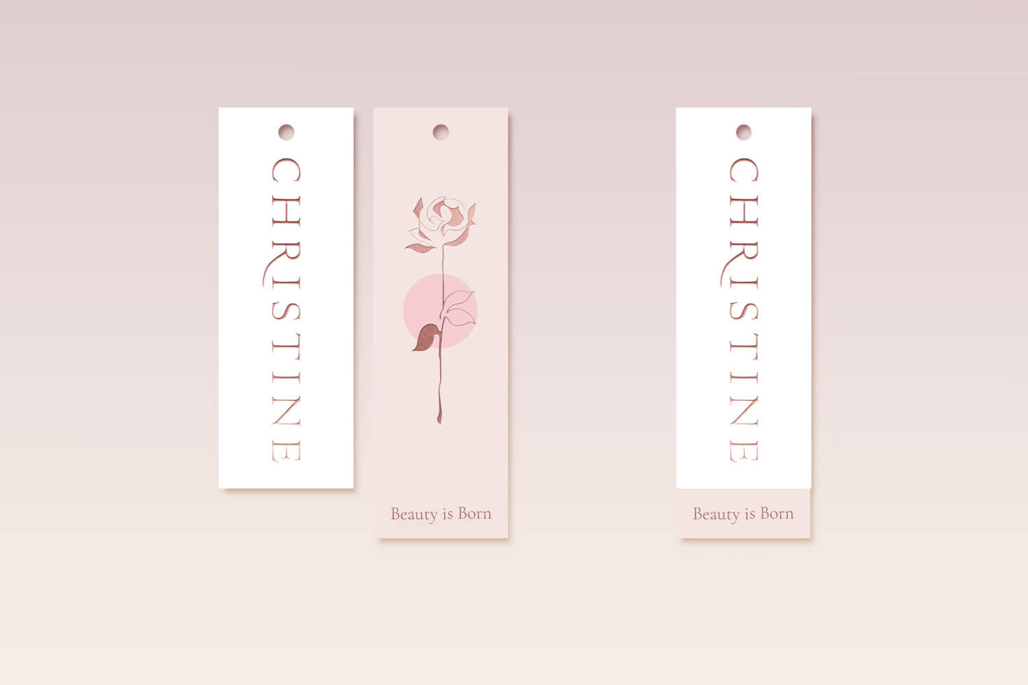
Where Beauty is Born
As artists of moments, Christine Lingerie has the unique ability to mirror the beauty in the world into their exquisite, hand-crafted collections. They believe that everyone deserves to look and feel beautiful. Tailoring each garment to each individual's need, they take pride in their dedication and attention to detail.
When it came to refreshing Christine Lingerie's brand identity, we wanted to recognize the artistic way they see the world. Christine Lingerie's classic pieces are designed to be timeless and elegant and we wanted a brand identity that compliments that.
The new brand refresh highlights on intimate moments and is designed to emanate the feelings of intimacy and the sense of discovery in new love. As an evolution of the brand, the refresh does not stray too far by incorporating some of the brand equity from it's previous logotype.
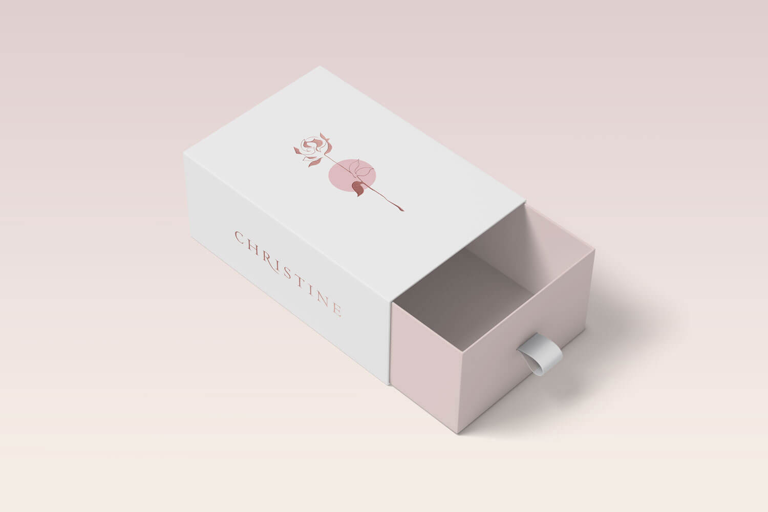
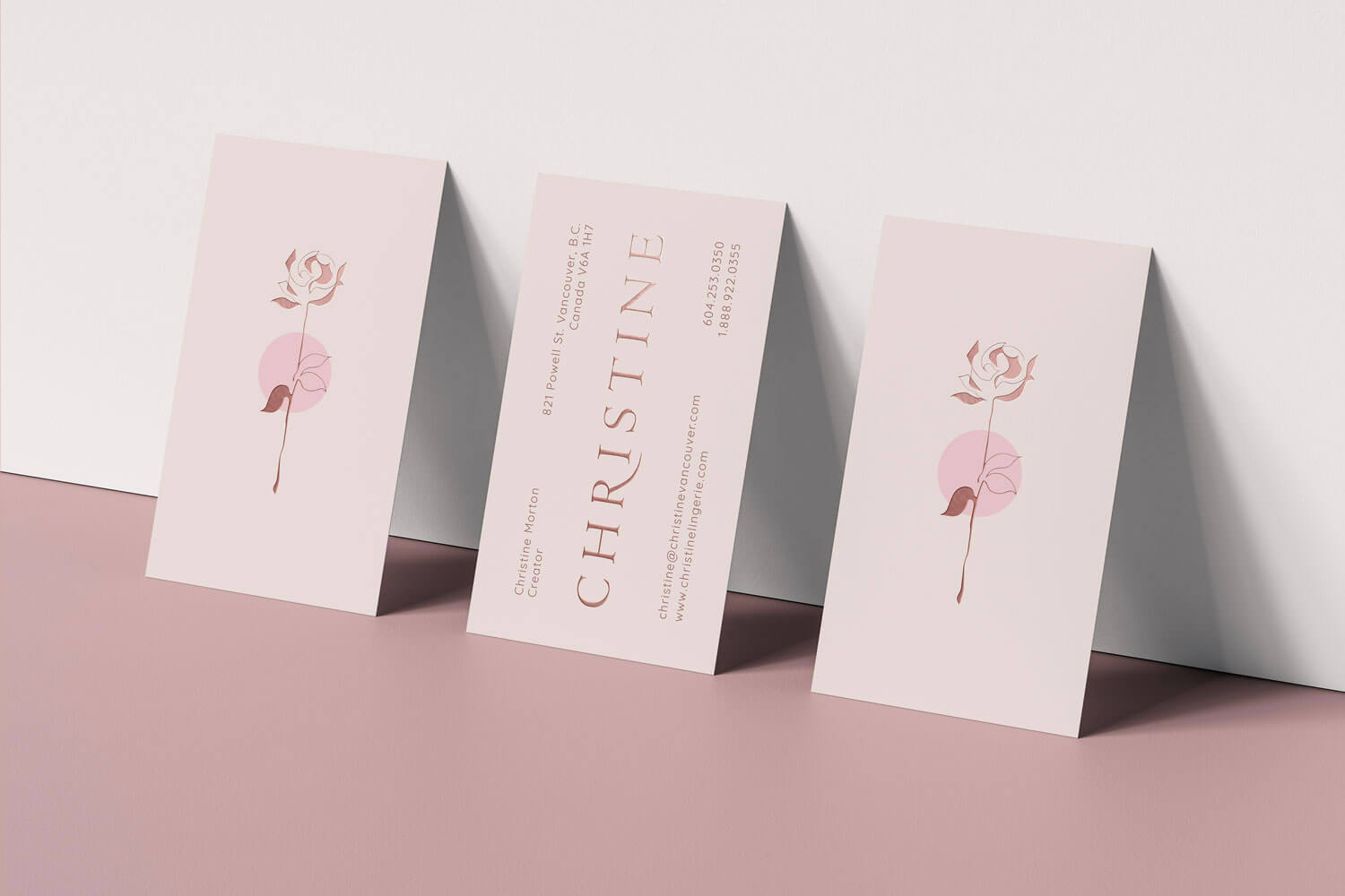
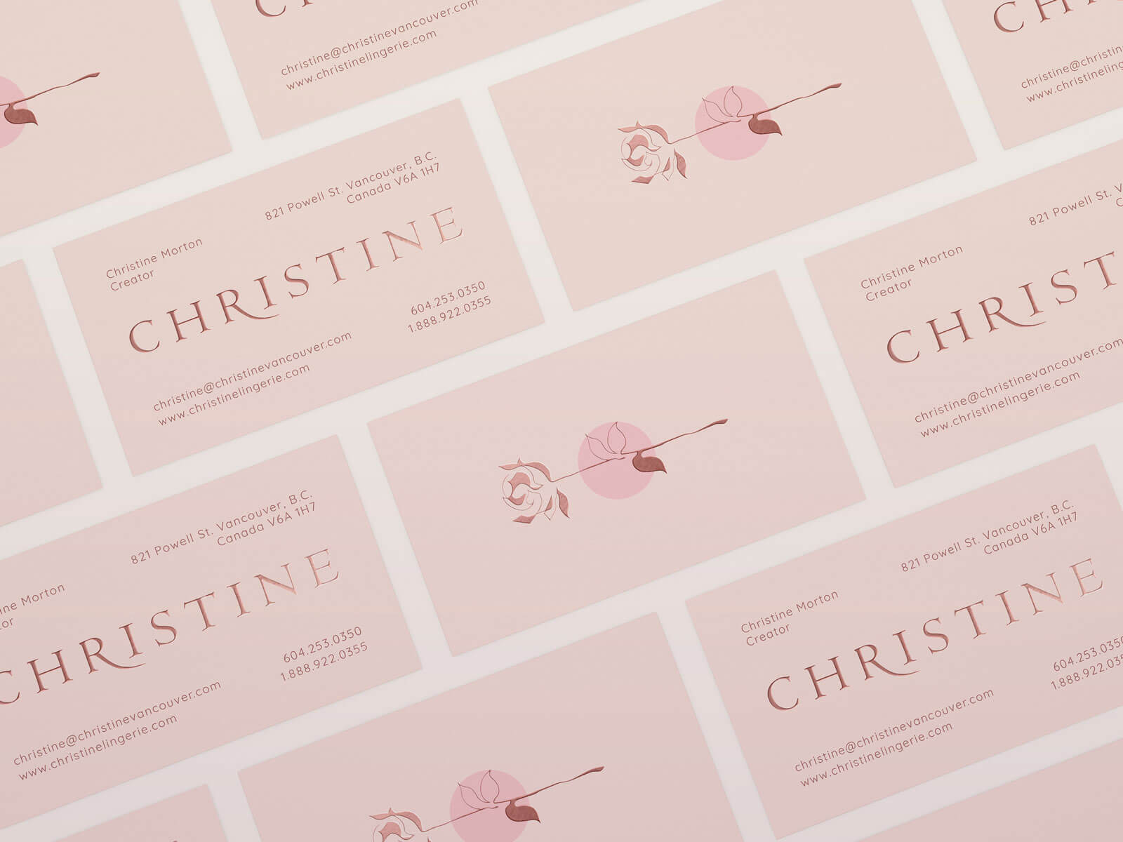
The logotype uses sans-serifs with smaller, petit slabs evoking a romantic, renaissance feel while remaining timeless and modern. The kerning between the letters elude to the openess of new possibilities and romance.
Using embossing to create a sense of refined elegance, the copper foil accents reflect the imagery of being wrapped and engulfed in a warm embrance. The circular splash of colour in the logomark represents the family collaboration that Christine is built on, its values in inclusivity and collaboration. Constrasted with the foiling, the extra texture evokes the sensation of touch and intimacy.
A Moment that Lasts
With the new website, the goal is to elevate Christine's online presence to reflect the exceptional in-store service by enticing new customers to experience the quality and beauty of Christine's products. After conducting a series of interviews and workshops alongside user research, persona creation, workflows, and user testing, we designed the new responsive e-commerce website based on Christine's retail and online customer needs.

Everlasting Beauty
Drawing on inspiration from visiting Christine's studio and viewing their pieces as works of art, we found an opportunity in a more artistic exploration. Using a media heavy approach, we designed moodboards for Christine's collections with close-up patterns and product shoots to create a sense of discovery inviting customers to explore.
As one of the interface designers and developers, I was responsible for developing the website for WordPress using Elementor Pro and WooCommerce. As Christine's pieces are designed to be timeless, we wanted to create a website that can also withstand the test of time. We designed and developed it using components that are flexible and easy to edit to so that it can live beyond us and remain relevant to their audiences.

Primary Logotype
Primary Logomark

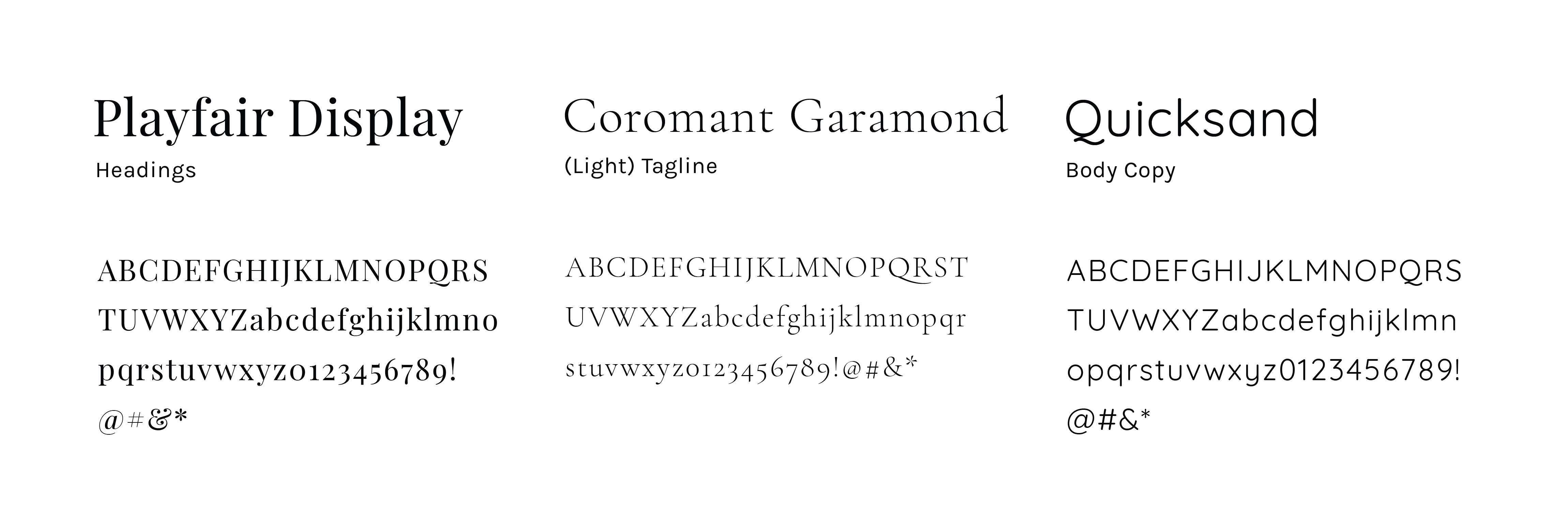
Typeface
Colour Scheme


Tagline

lockup

